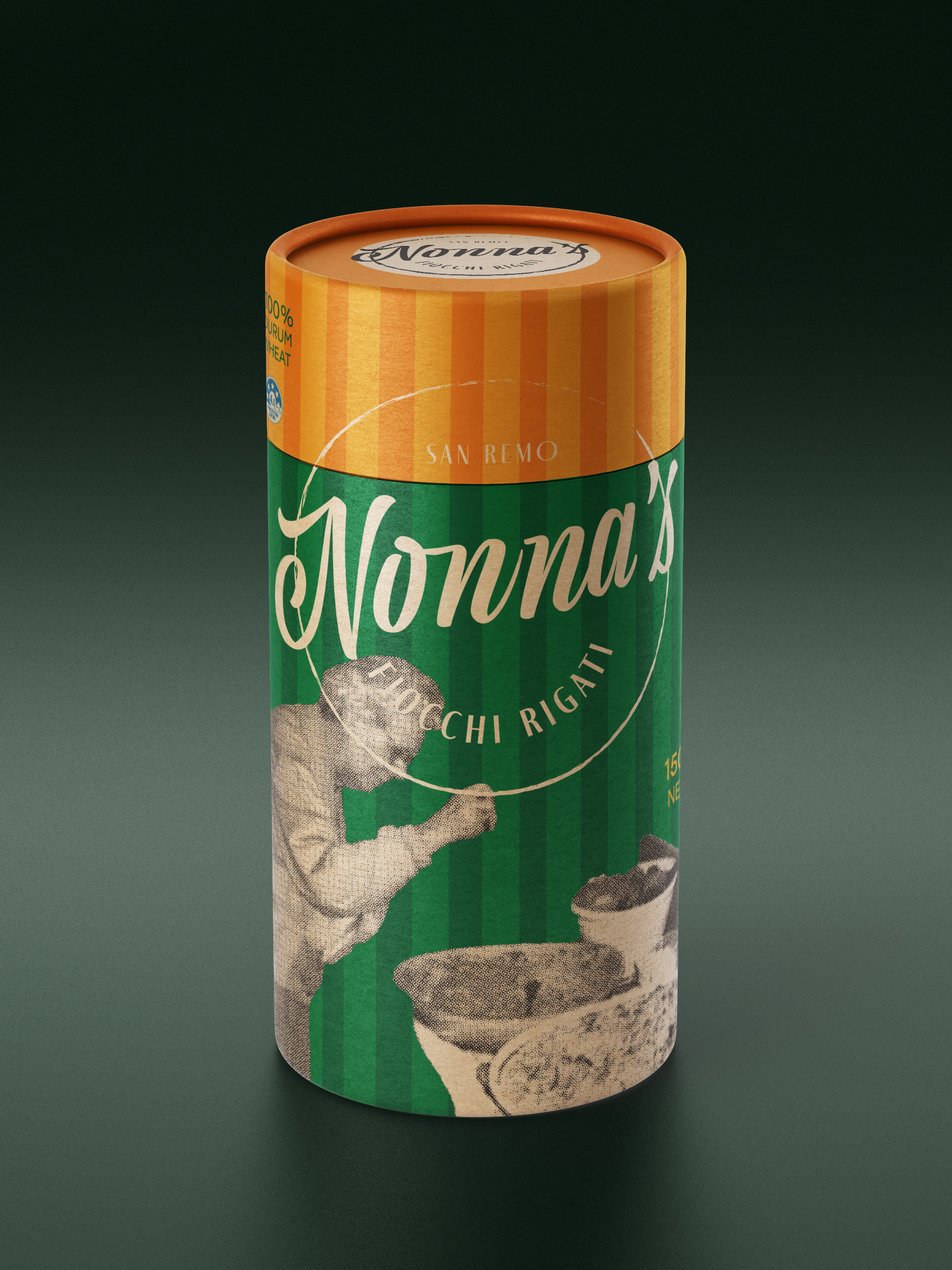
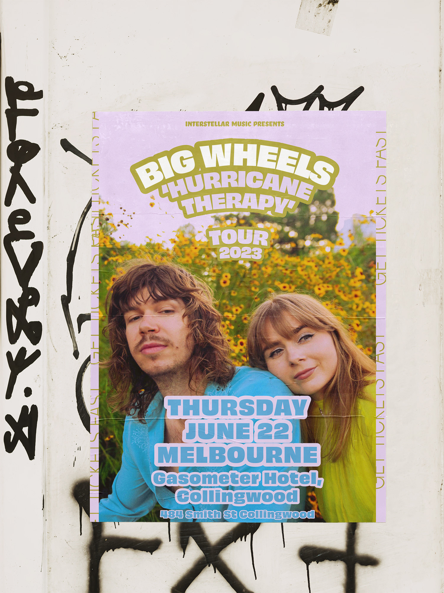
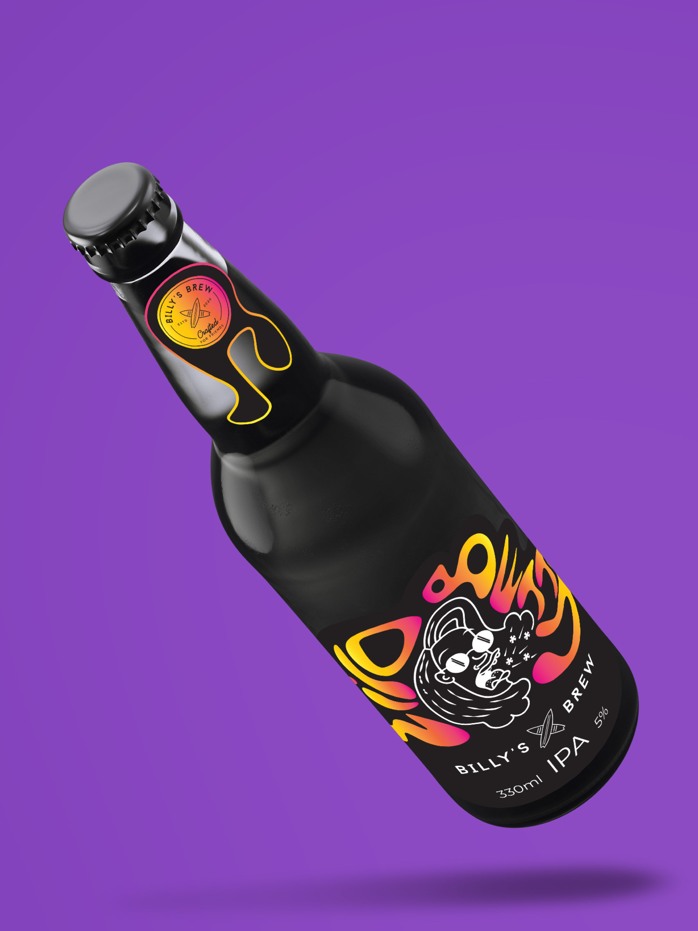
Student work - Rebranding project for Yellow tail wine company.
For this project we were tasked with re branding a well known company by analysing its strengths and weaknesses. The Kangaroo is a widely used and popular logo so I wanted to go with something less literal as a way to reinterpret the brand.
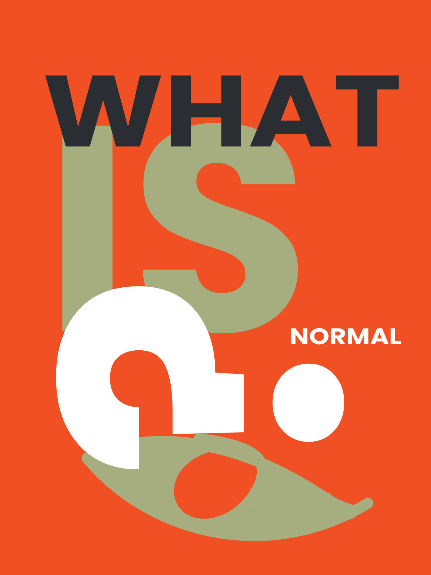
I chose to use the foot print as a way to challenge the usual connotations with the kangaroo symbol, whilst still representing the animal in a different way. As an experiment, I used the Rorschach test as a platform to explore different forms. This created an interesting range of assets that can be further explored for its fun subjectivity and talking point!
For these images I used black acrylic paint and pressed the image like you would in pre school! then used photoshop to reach the desired effect.

