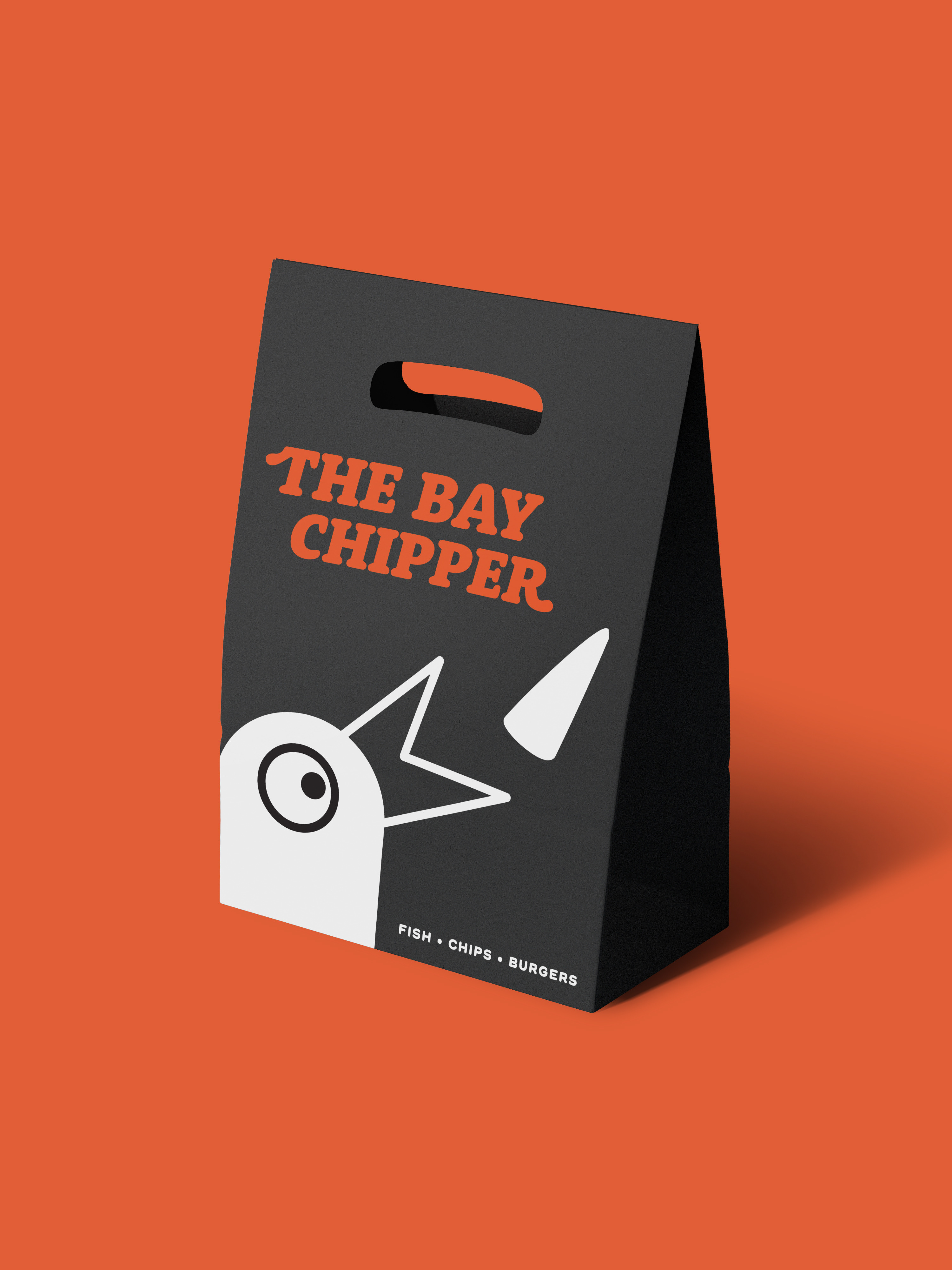
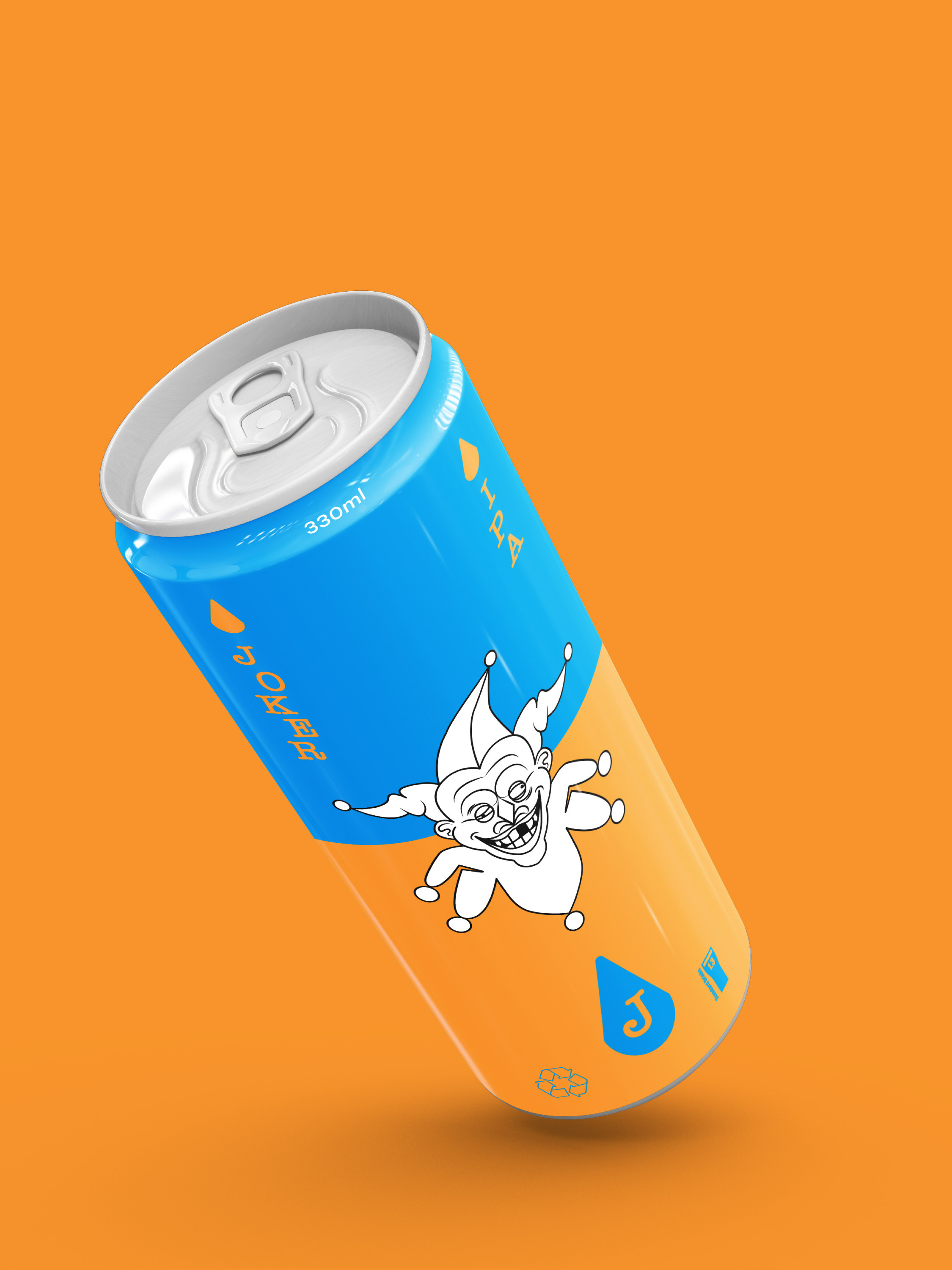
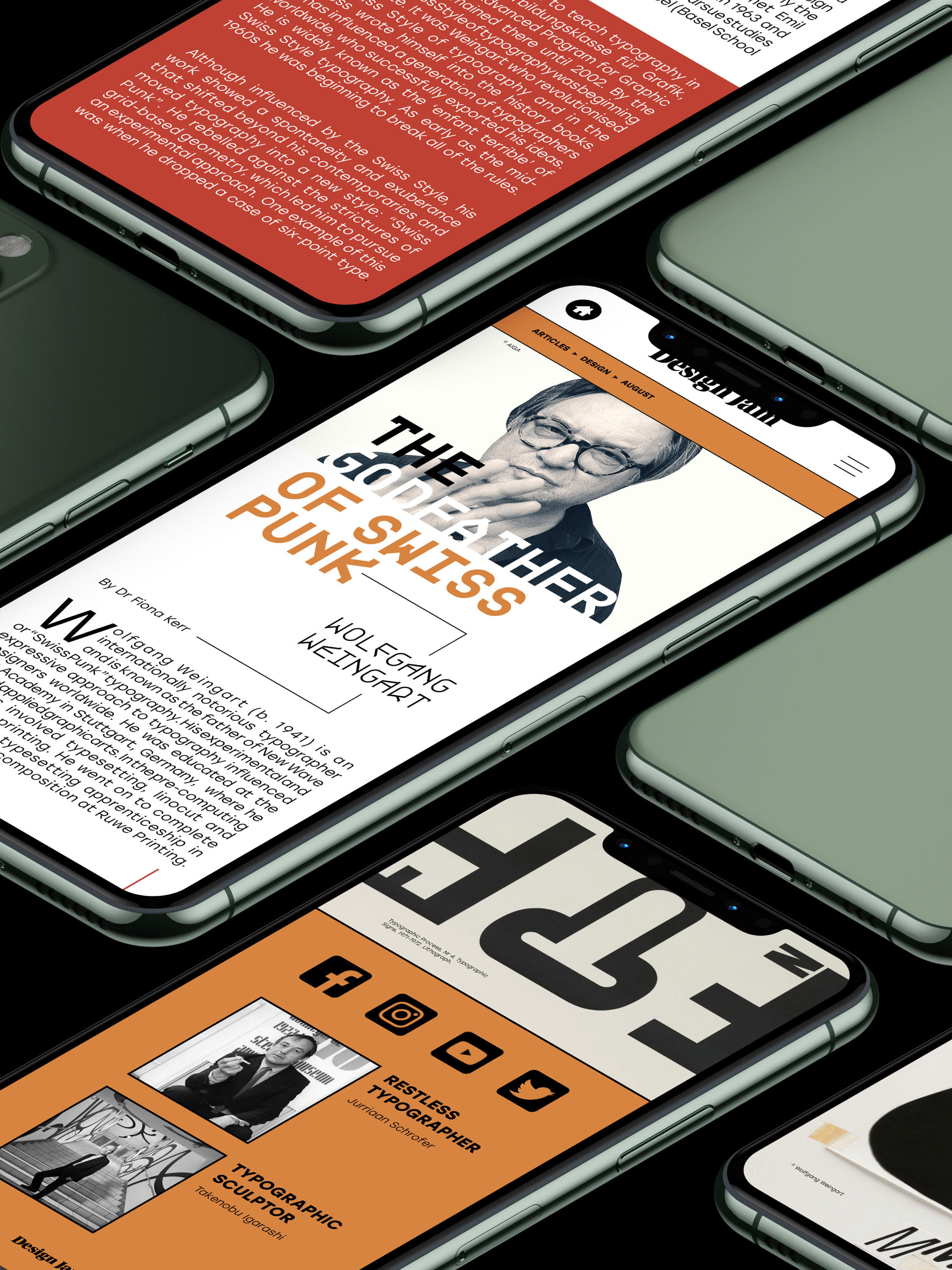
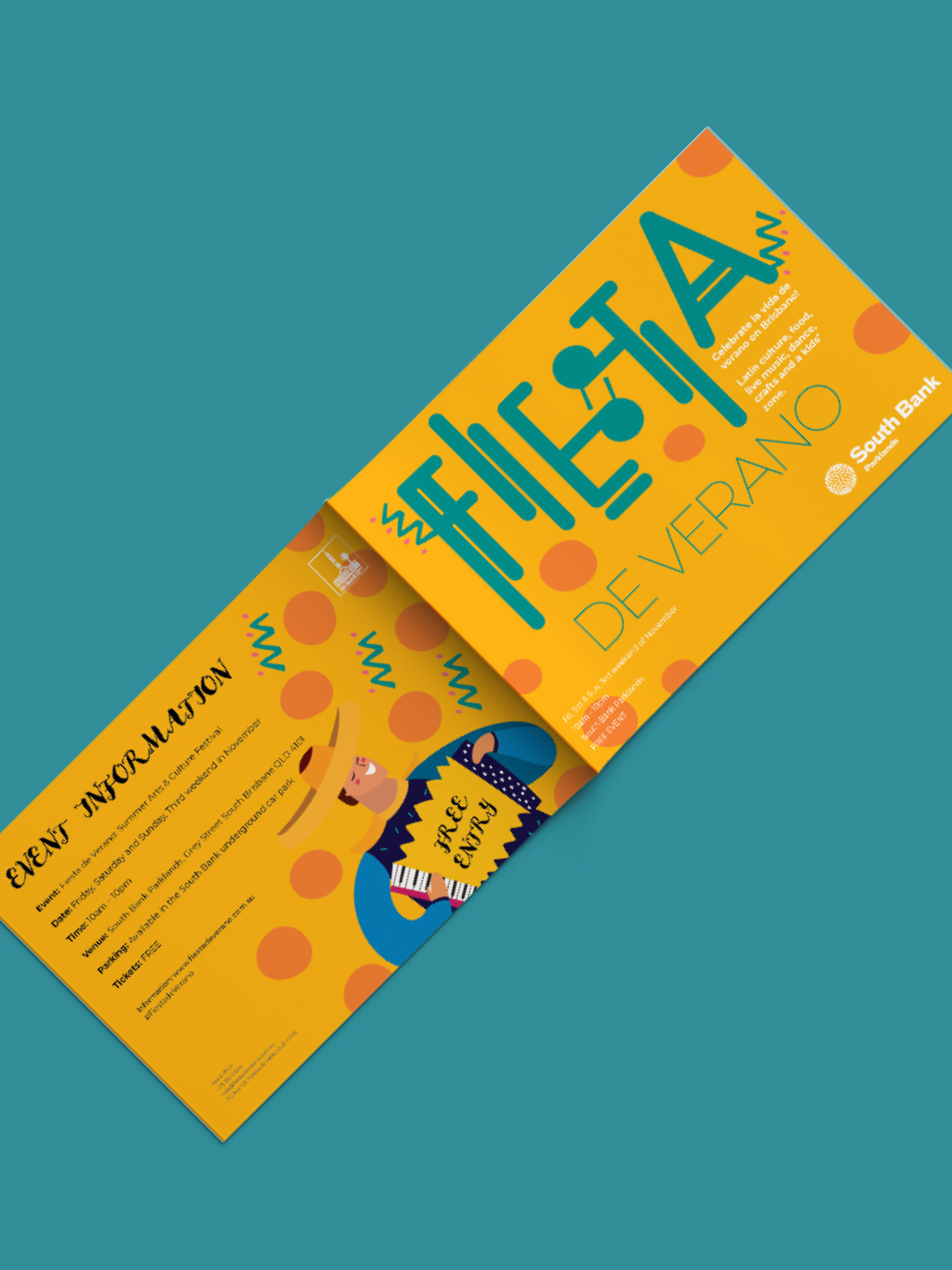
Student work - Typography and experimentation
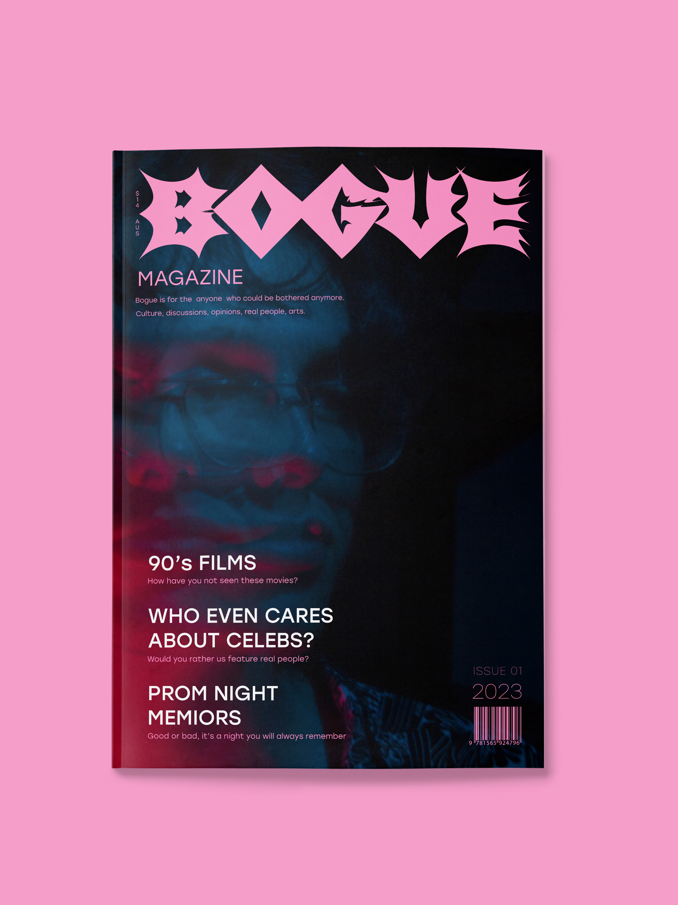
For this project I used a box cutter and some charcoal to get some interesting textures, then used photoshop to overlay the photos. I wanted to do something messy and experimental and play with the medium of paper in a magazine setting.
Well known designer, David Carson was a great inspiration for his asymmetric and grungy design aesthetics. I used Justified type as a challenge, to achieve a clean cut look for body the copy and juxtapose that with a random, hand made look for the cover.
