Student work - Integrating a magazine spread for digital platforms.
Based on designer Wolfgang Weingart, I was inspired by his methodology and approach towards print as a medium!
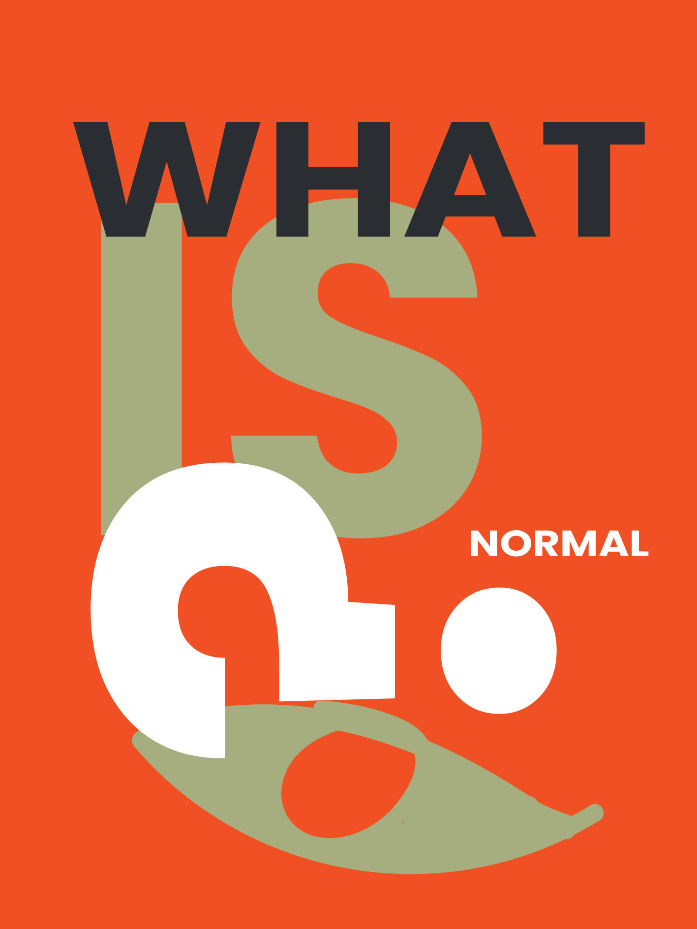
This project was heavy on the text, and was excellent for learning formatting and typography skills. From drop caps, paragraph styles, leading and kerning, paragraph styles, text wrap and more!
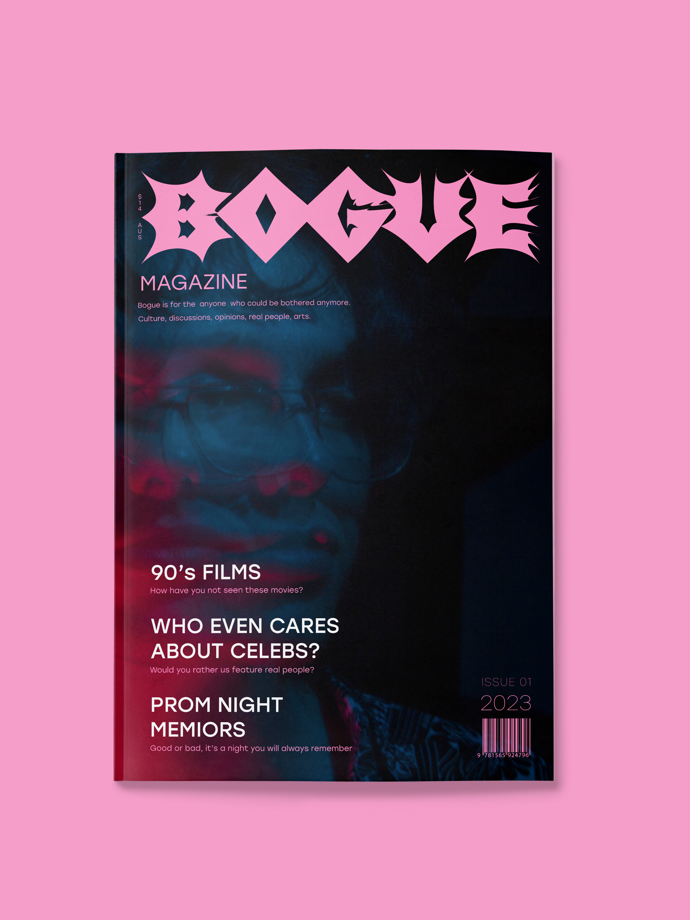
Then once those widow's and orphans are sorted, completely redesign and optimise for online platforms. This was an undertaking, but the end results are satisfying.
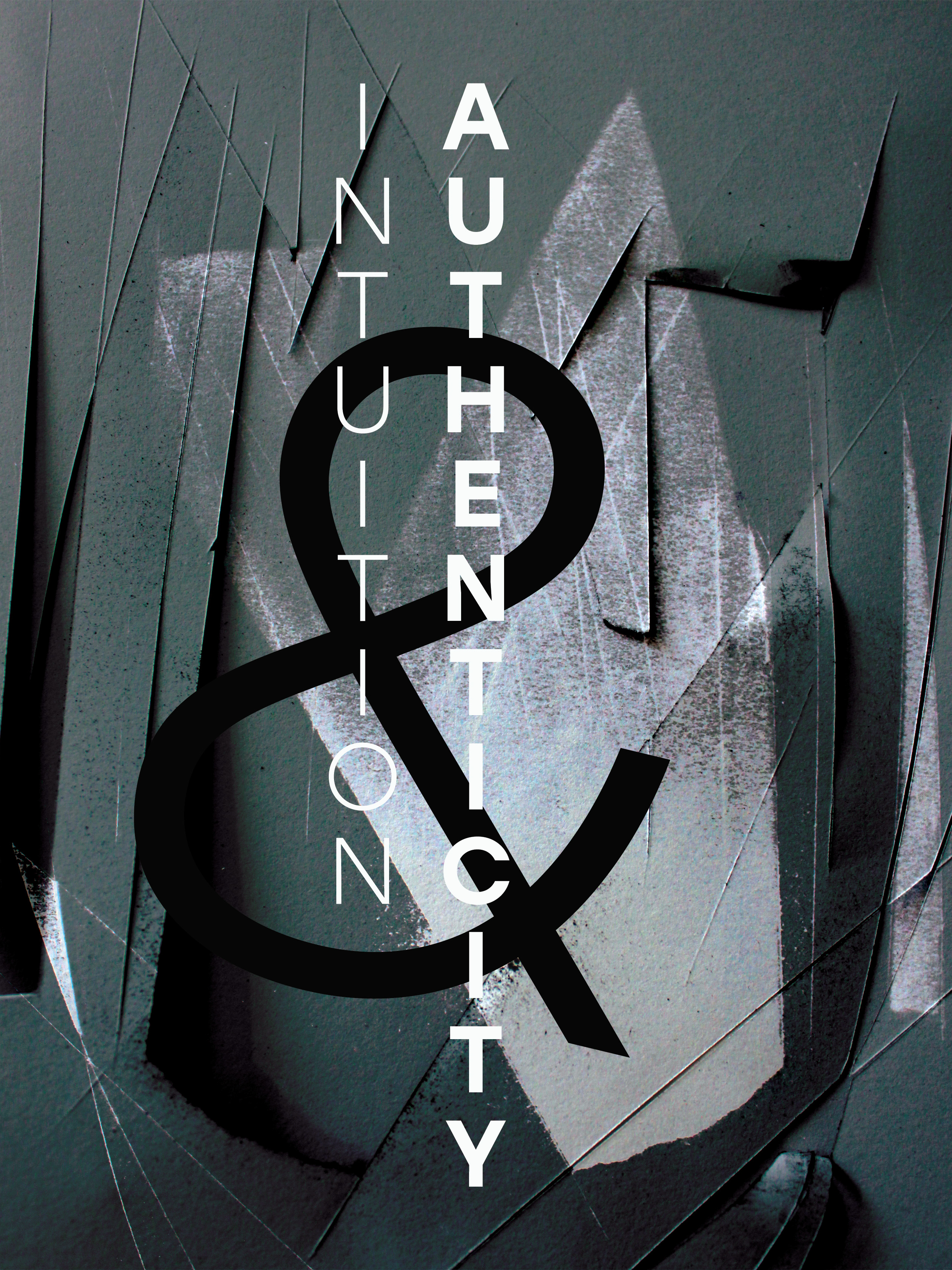
These experiments were about using paper and print in a different way to achieve unique results! Gotta love a good old photocopier.

